

A Unified Brand Strategy to Reposition Asia's Leading Capital Markets and Investment Group
CLSA is an Asia-based financial services and investment group established in 1986 with a global network spanning 21 locations across Asia, Australia, Europe, and the United States.
In 2013, CLSA was acquired by China’s largest brokerage and investment bank, CITIC Securities. In 2016, CITIC Securities announced that CLSA would become the international banking platform for CITIC’s global expansion, shifting CLSA away from being an agency-only institutional equities broker to a full-service, integrated investment platform.
Re-positioning the New CLSA Brand
CLSA engaged Sedgwick Richardson to create a unified brand strategy that would reflect the breadth and depth of its expanded business lines, creating a compelling new brand proposition and visual identity to signal that the ‘new CLSA’ is here to stay—and ready for long-term growth.
A rebrand was fundamental to bring clarity to CLSA’s brand portfolio with respect to CITIC Securities, while maximising the brand equity found in both entities – to create a cohesive and persuasive offering.
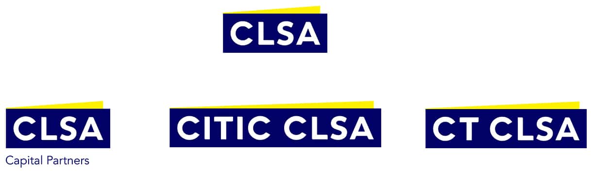
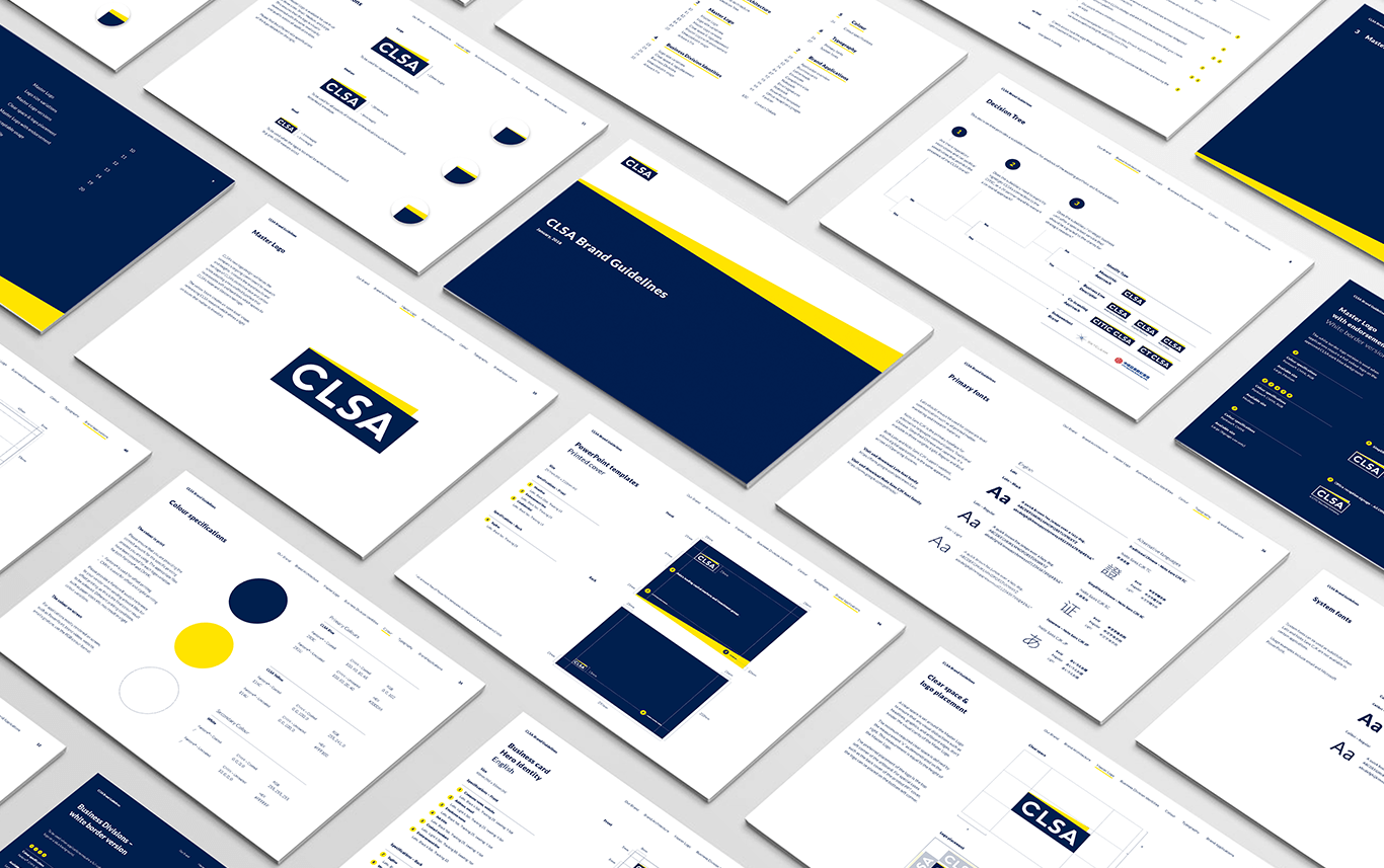
A Monolithic Architecture to Unify Identity
The yellow ‘beam’ creates an ‘open-book’ shape, referring to CLSA’s research arm, shining a light on issues that matter to investors. The new logo design reinforces the company’s ongoing commitment to research and insights, retaining the brand equity and heritage of CLSA’s distinctive blue and yellow while adopting a new crafted typeface that incorporates soft and hard lines. This speaks to CLSA’s international heritage.
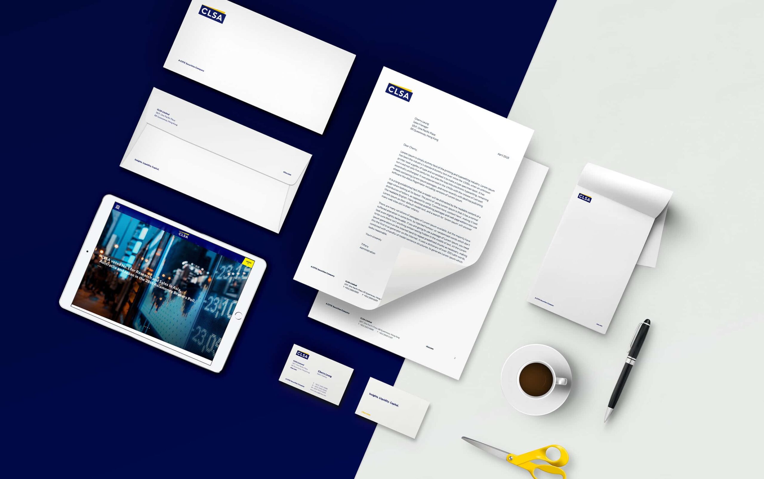
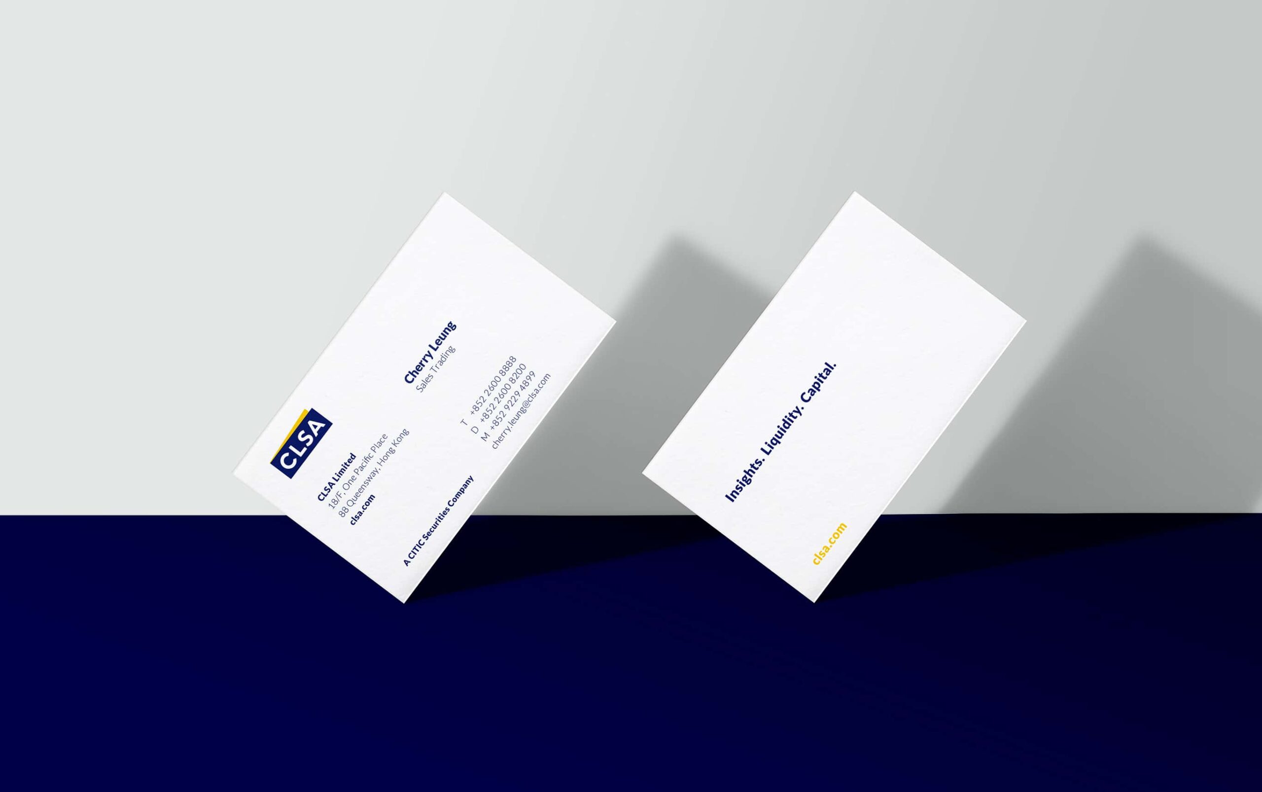
The new identity flows through environments, stationery and digital applications, all captured in comprehensive guidelines.
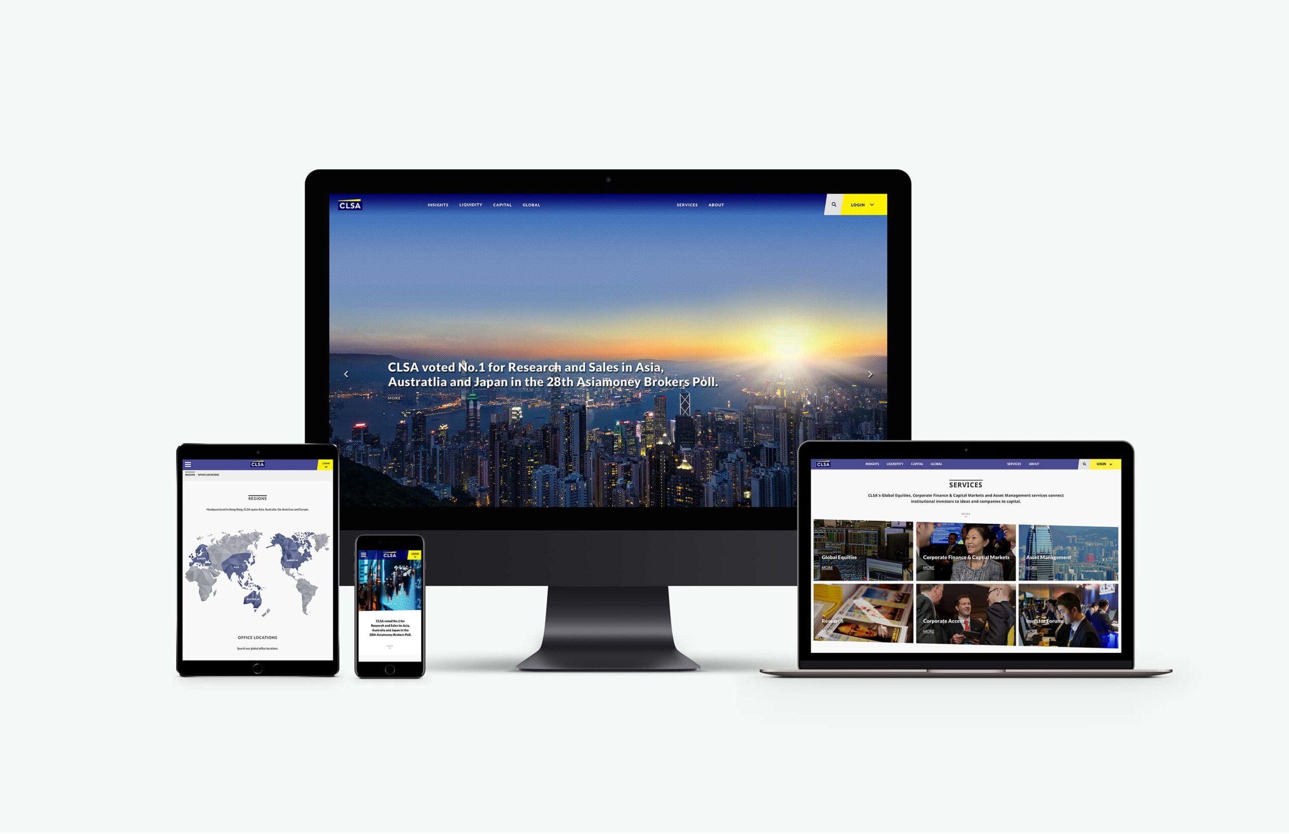
A refreshed website and visual direction positions CLSA as a forward-thinking, entrepreneurial business.