

Creating a Corporate Brand Signalling a New Chapter of Growth
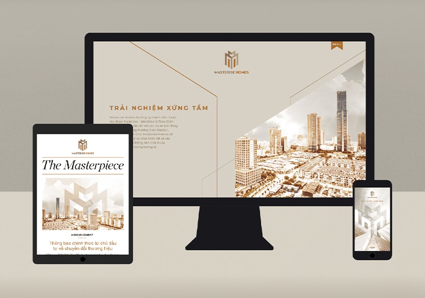
Thao Dien Investment, known for successful residential brands such as Masteri, M-One, and Millennium, had long focused on product-level recognition while its corporate identity remained under the radar. As the company prepared to evolve into a broader real estate ecosystem, the opportunity emerged to reposition the parent brand—culminating in a high-profile launch at the ‘Master of Symphony’ event in Ho Chi Minh City.
With a growing portfolio and ambitions beyond residential property, Masterise needed a strong corporate brand that could unify its sub-brands, reinforce credibility, and signal leadership in Vietnam’s evolving real estate landscape.
Establishing Systems for Consistency and Growth
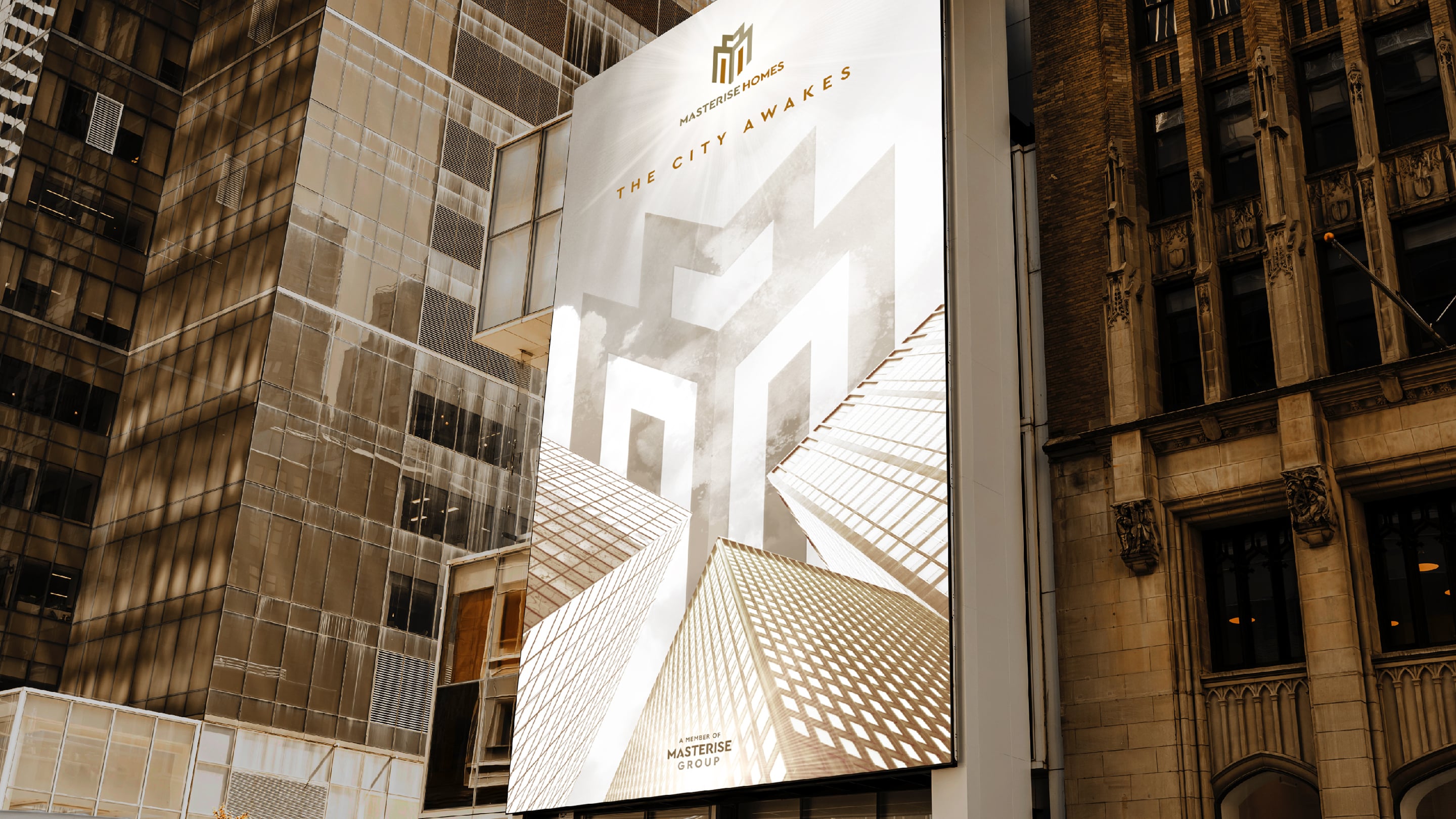
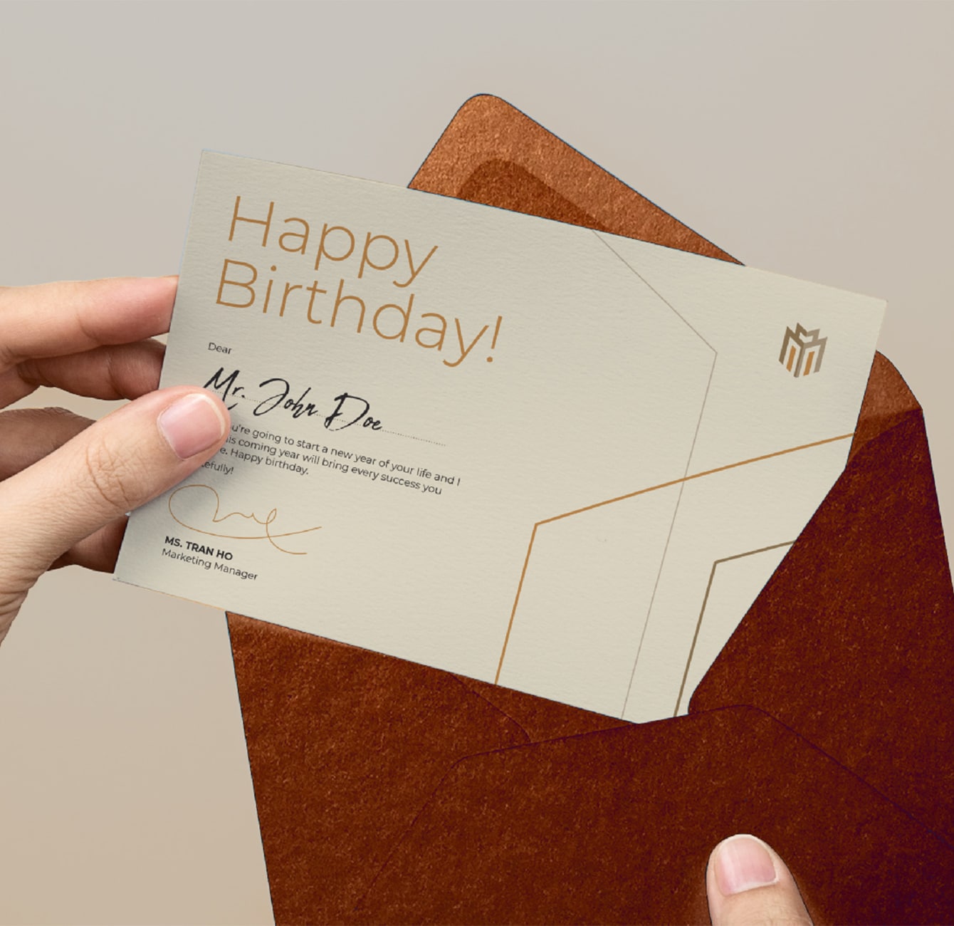
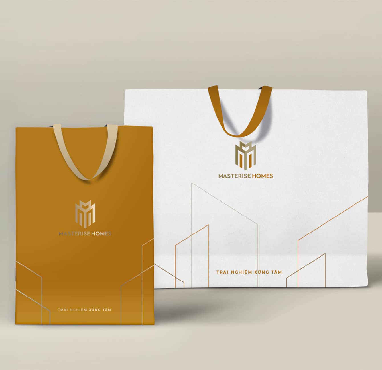
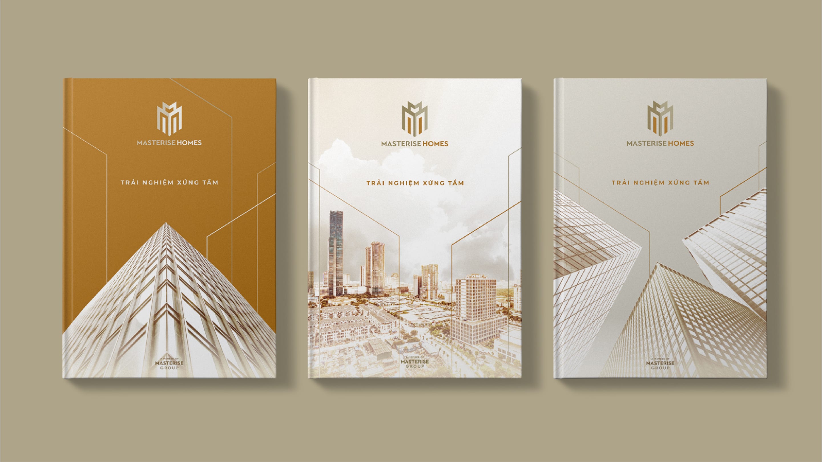
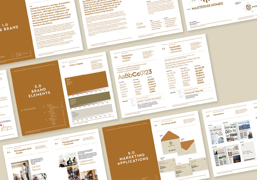
SR developed a bold, crown-inspired brand mark that conveyed authority and leadership, extending it seamlessly to Masterise Homes for portfolio cohesion. A flexible graphic device, inspired by city skylines, brought consistency across communications. The brand came to life through refined photography, tailored uniforms, and a strong visual system across digital and physical touchpoints. Two comprehensive brand guideline documents were created to support long-term brand management, enabling the company to scale with clarity and confidence.
Launched at the prestigious Master of Symphony event, the new Masterise Group brand was met with strong approval from both leadership and industry peers. With a bold identity and an aligned system, the brand now confidently reflects its role as a visionary force in Vietnam’s real estate sector.