

A Brave Re-Branding Solution for a Boutique Legal Firm
Bernard and Rada were two of three founding partners who started in the Singapore Legal Service, before leaving to start Bernard & Rada Law Corporation. Over the past three decades, they had built a well-respected practice focusing on litigation and a reputation for taking on larger adversaries. With over 30 years in practice locally, the firm had started to expand its practice areas to include conveyancing, corporate, commercial, intellectual property, data protection, technology, and other areas of legal-related services. At the same time there was a need to be accessible to clients regionally and globally, and to ensure that the goodwill was associated with the law firm’s brand rather than just its founding partners.
Bernard & Rada Law Corporation decided that a comprehensive corporate rebranding was required to achieve this and appointed Sedgwick Richardson’s Singapore team to the task.
Through an in-depth discussion with the founding partners, we quickly identified the shared beliefs that set the firm apart. Born out of litigation, the firm’s values were based on integrity and having to take on much larger adversaries.
The firm’s smaller size and structure gave clients access to experienced partners and so personal service from legal experts was one level on which the brand might differentiate itself. But it was the culture of a small firm of ’combat-fit’ lawyers ever ready to relish the next challenge that inspired a David (vs Goliath) positioning, a brand purpose that champions the underdogs.
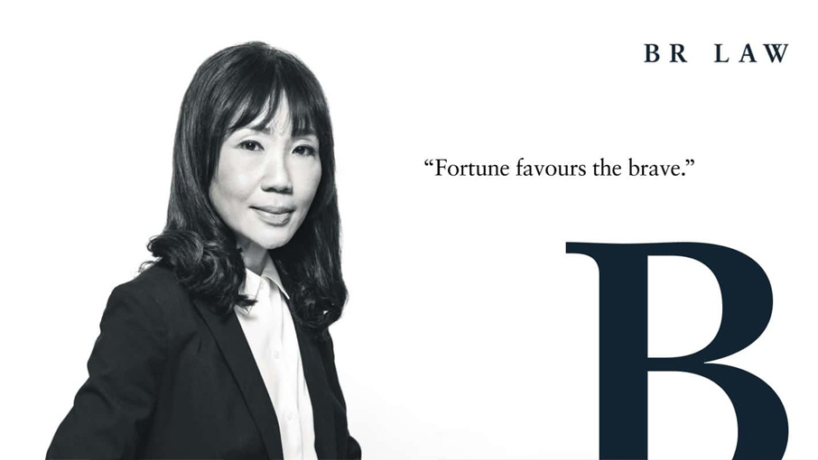
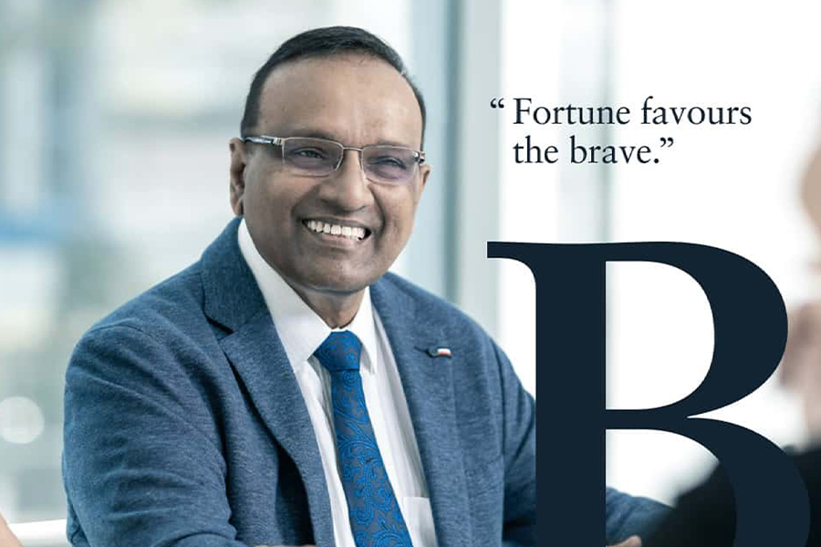
Brand Personality
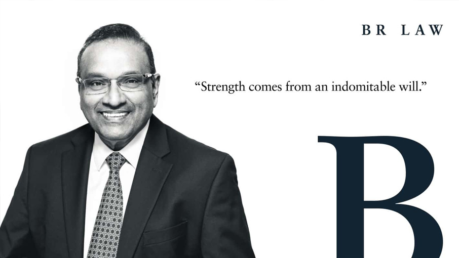
A set of archetypes was used to help craft the corporate brand personality around Strength. Courage. Wisdom. The timeless values of an entity born to face far greater adversaries, now define a growing business ecosystem of seasoned professionals and experts. The people are the heroes of this story, portrayed with depth and character.
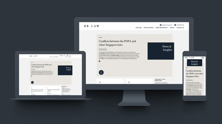
Brand Identity
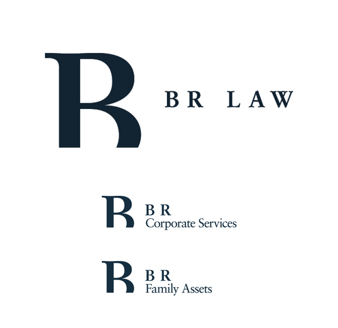
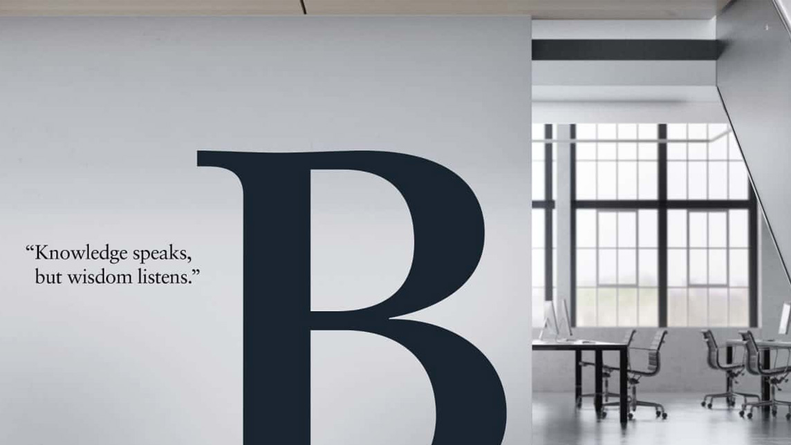
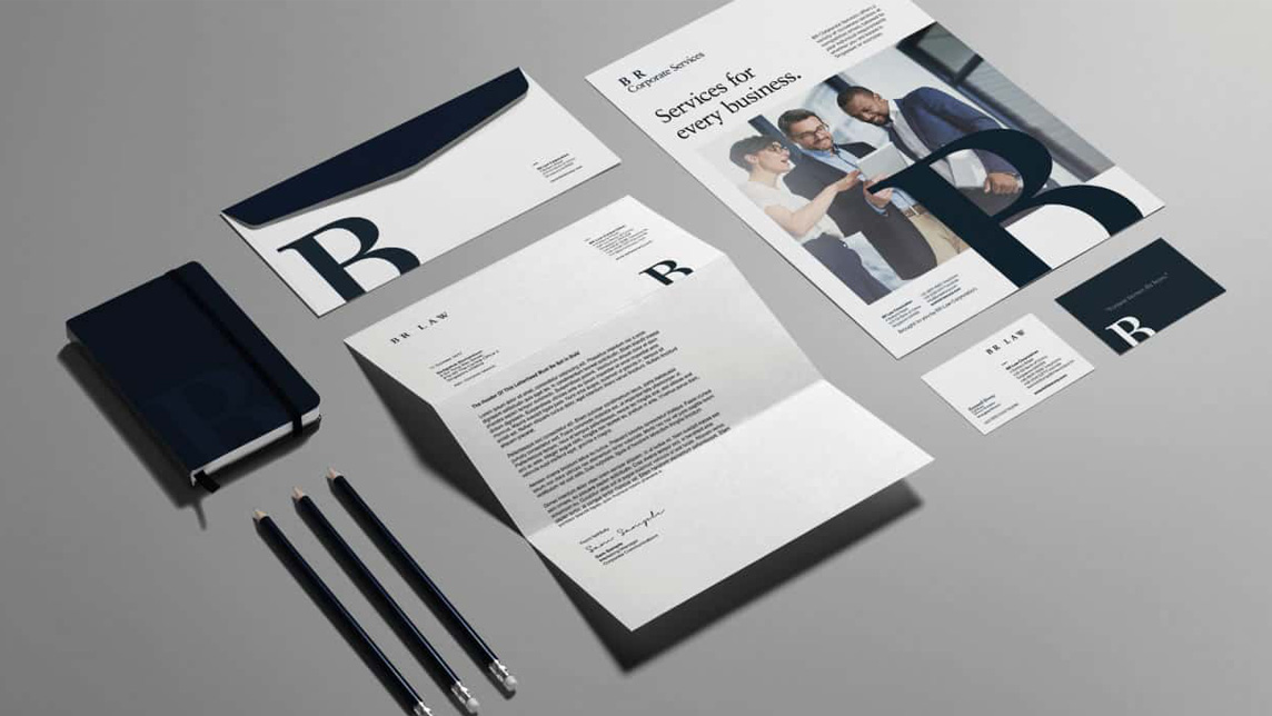
The mark is crafted using simple typography, a clever combination of the letters ‘B’ and ‘R’ into one single letter form symbolising the unity of the business. The serif font carries the brand name with dignity & elegance and the deep blue colour conveys professional gravitas.
Brand Expression
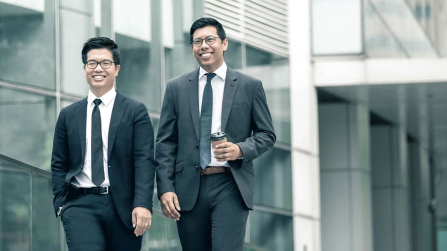
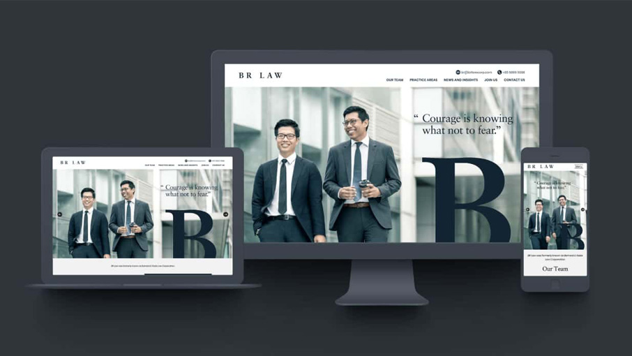
A photography style is inspired by the ethos of teamwork and partnership and a strong sense of people-focused commitment. A de-saturated photography style, with a cool colour palette brings a sophisticated, professional look.
Brand Touchpoints
Office reception signage and ideas on environmental graphics were designed to elevate the physical environment. An opportunity to refine the existing English corporate brochure preceded to establish a stronger brand identity for the firm.